How We Designed the Sanctum App
The Sanctum App started from a simple idea -- can you have fun while growing your wealth?
This was Sanctum's first attempt at building a consumer mobile app. We've built a small reputation for adding our delightful spin to whatever we touch, so we tried to stay true to that with the app.
This is more a note to myself, to remember how we went from concept to a real product in a few weeks.
Can you have fun while growing your wealth?
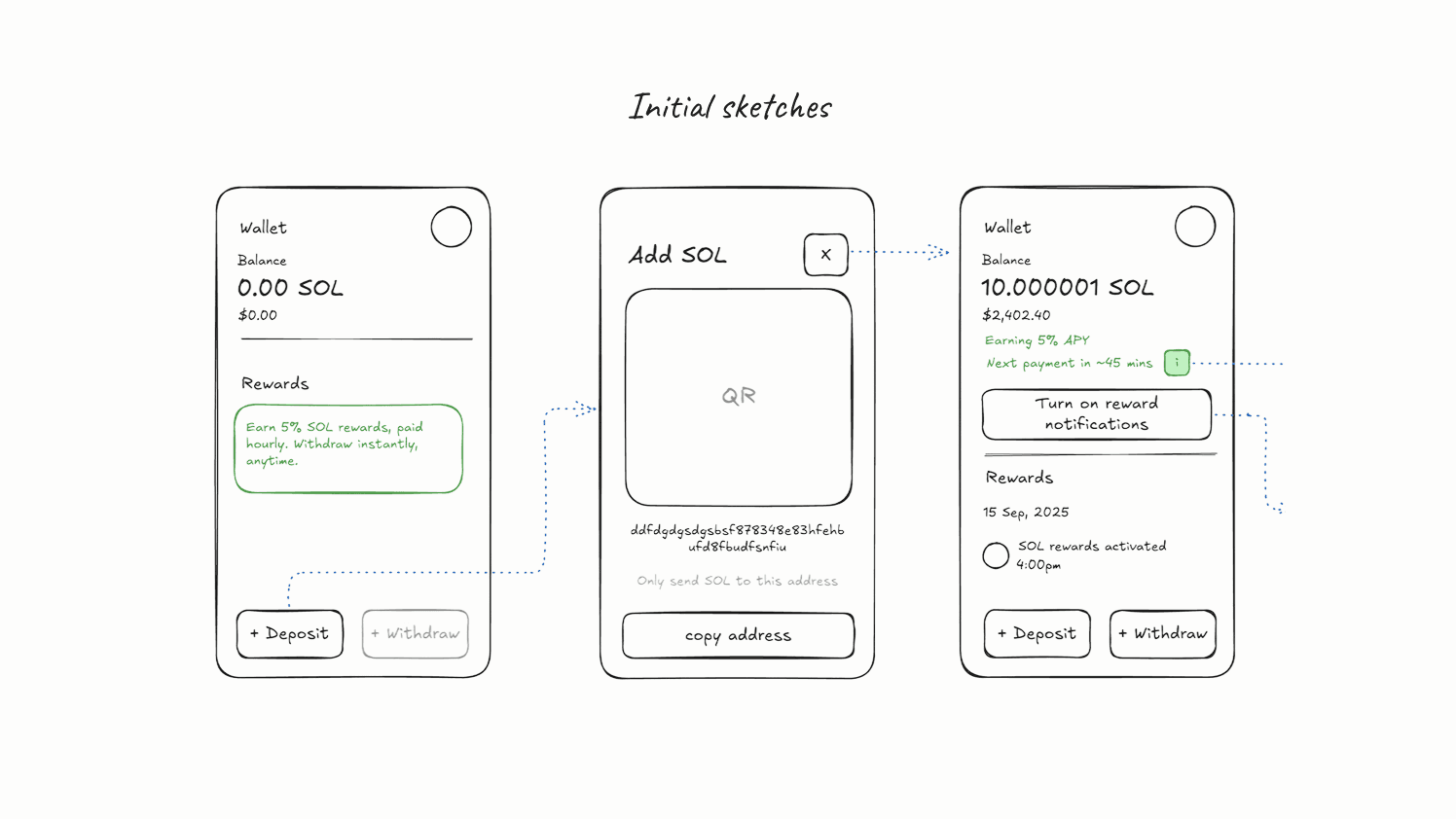
Initial explorations#
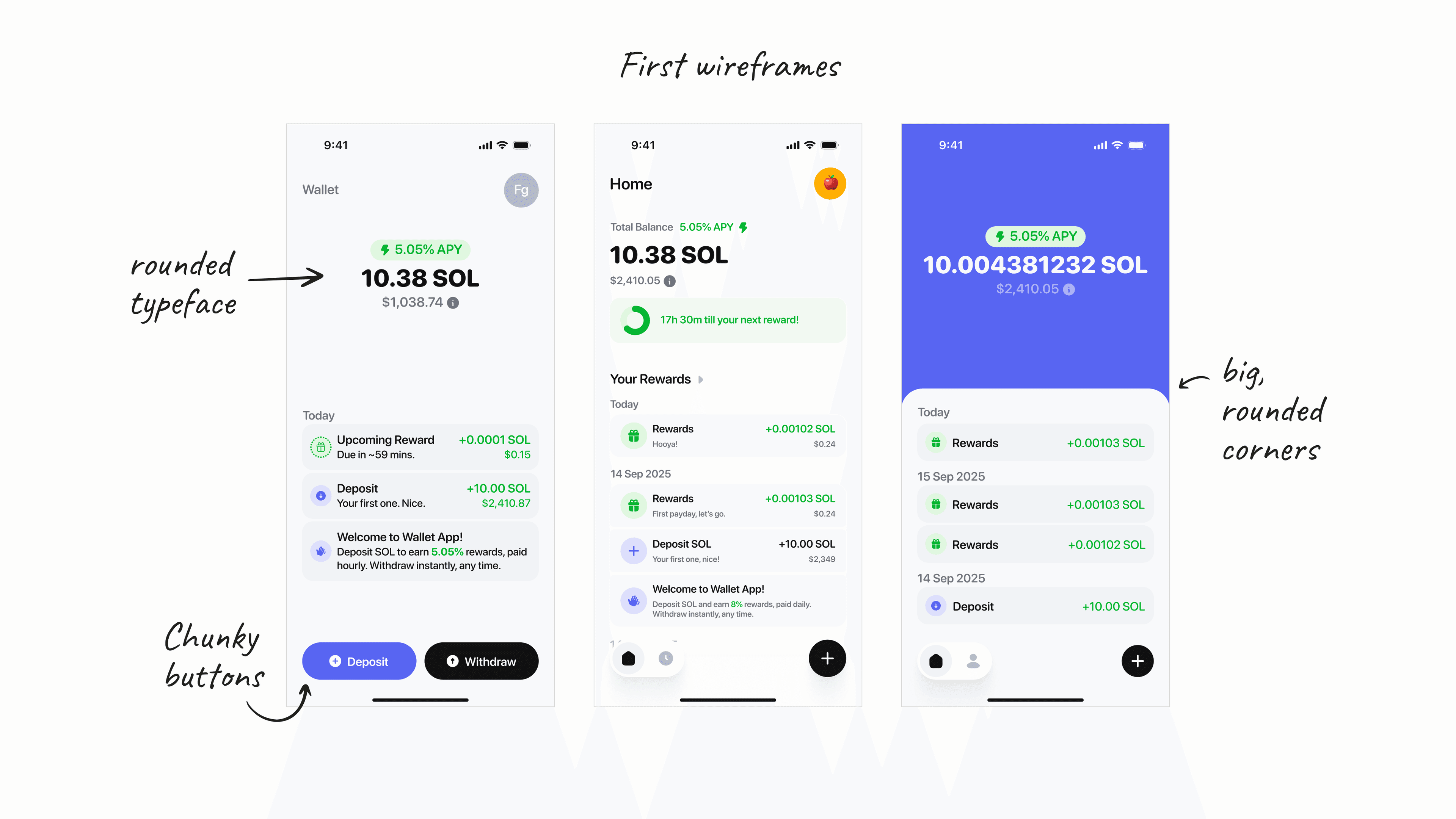
Looking back, purple wasn't great because it can look like it was done by AI (it wasn't).
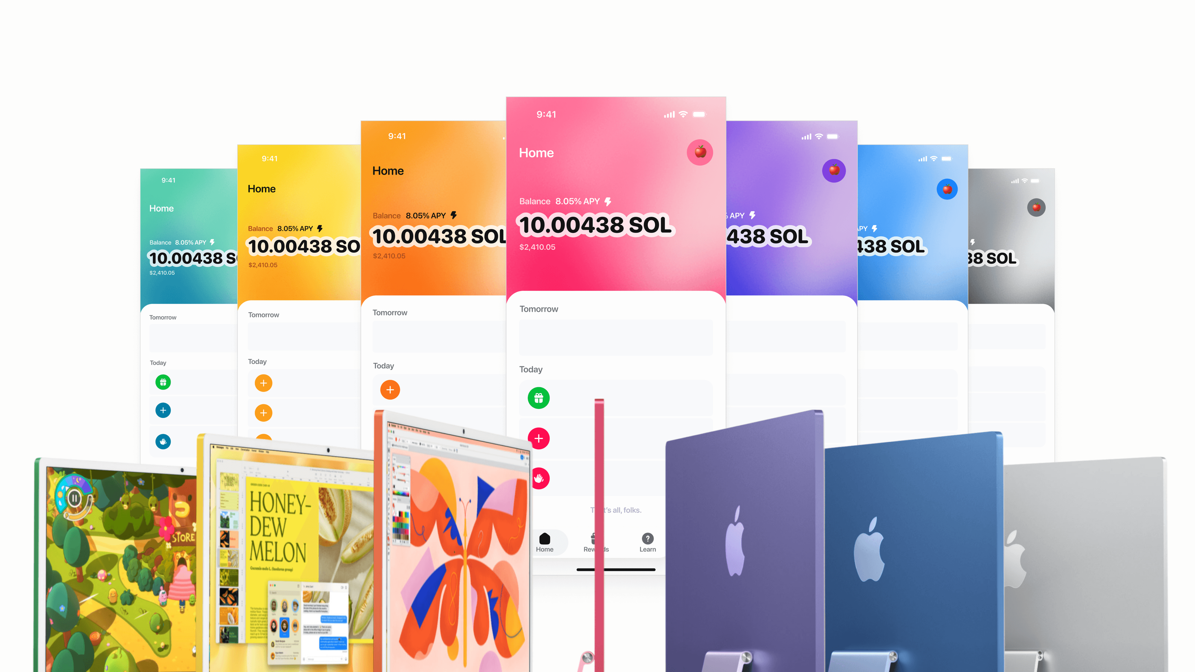
We even tried optional themeing of the app using iMac colours. We loved the fun yet polished vibe of iMacs.
Our first drafts turned out to be no different from the general design patterns of existing money apps. We didn't like this because the emphasis on account balance and asset prices can make you feel anxious about price fluctuations.
That makes holding for the long-term more challenging, and might lead to unintentional, emotional, short-term decisions.
North star: Building healthy, long-term habits#
We went back to the north star of the app: to help users build healthy financial habits by making what is usually a boring experience, fun and delightful.
Building healthy, long-term, compounding habits.
While we eventually kept some elements from our early explorations -- the rounded styles, bright colours and the bottom sheet on the homepage -- it was clear from our initial drafts that we still are far from achieving this vision.
People like cute things#
People like cute things, even adults! People also like caring for and growing something else apart from themselves. We learnt these lessons from the success of Wonderland, one of our most-loved consumer products.
With that, we made two fundamental decisions that shaped the design of the eventual Sanctum App:
- Introduce a cute mascot that users can care for while growing their wealth
- Double down on the fun and playful visual design style
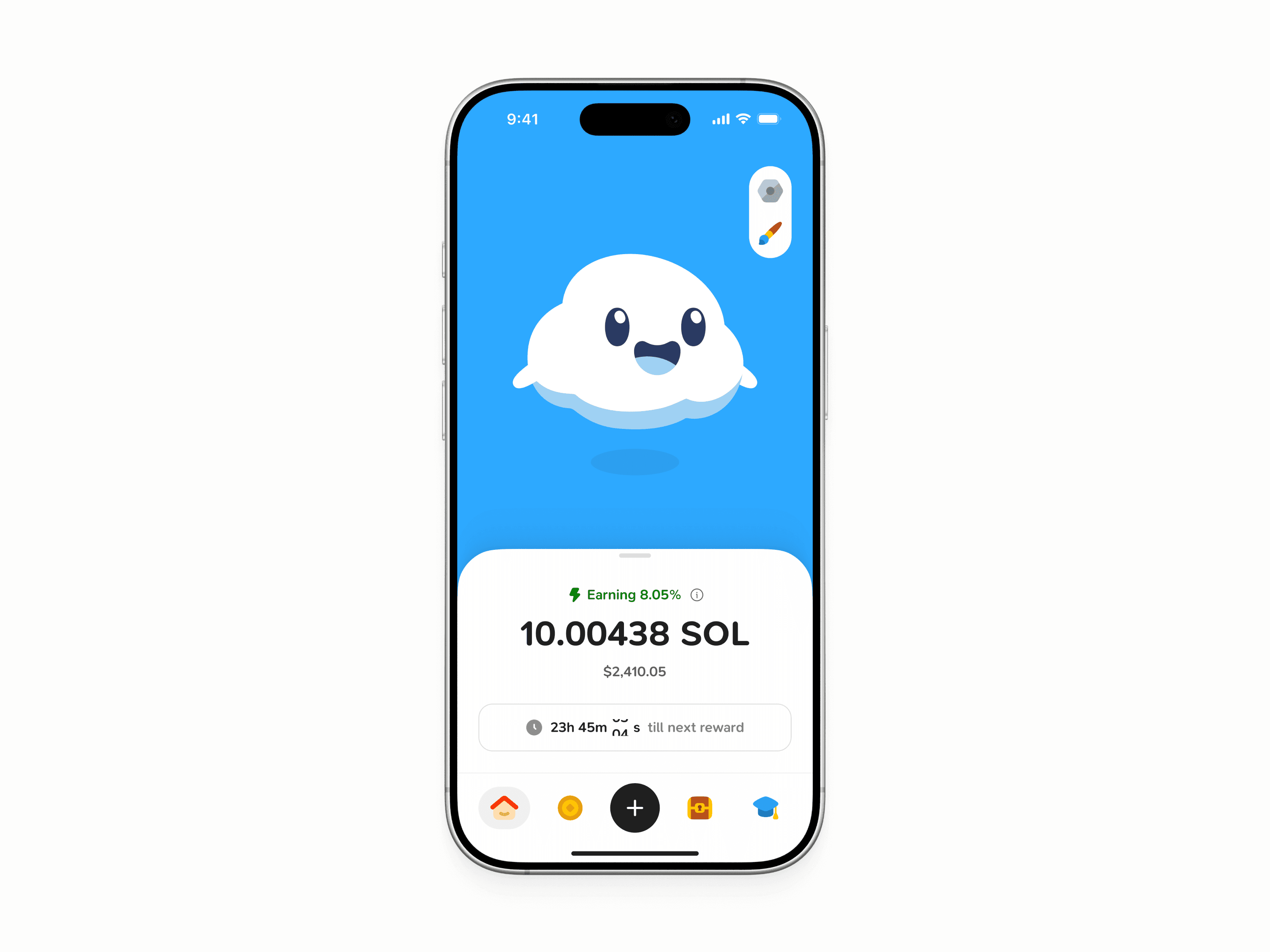
Albus and the XP system#
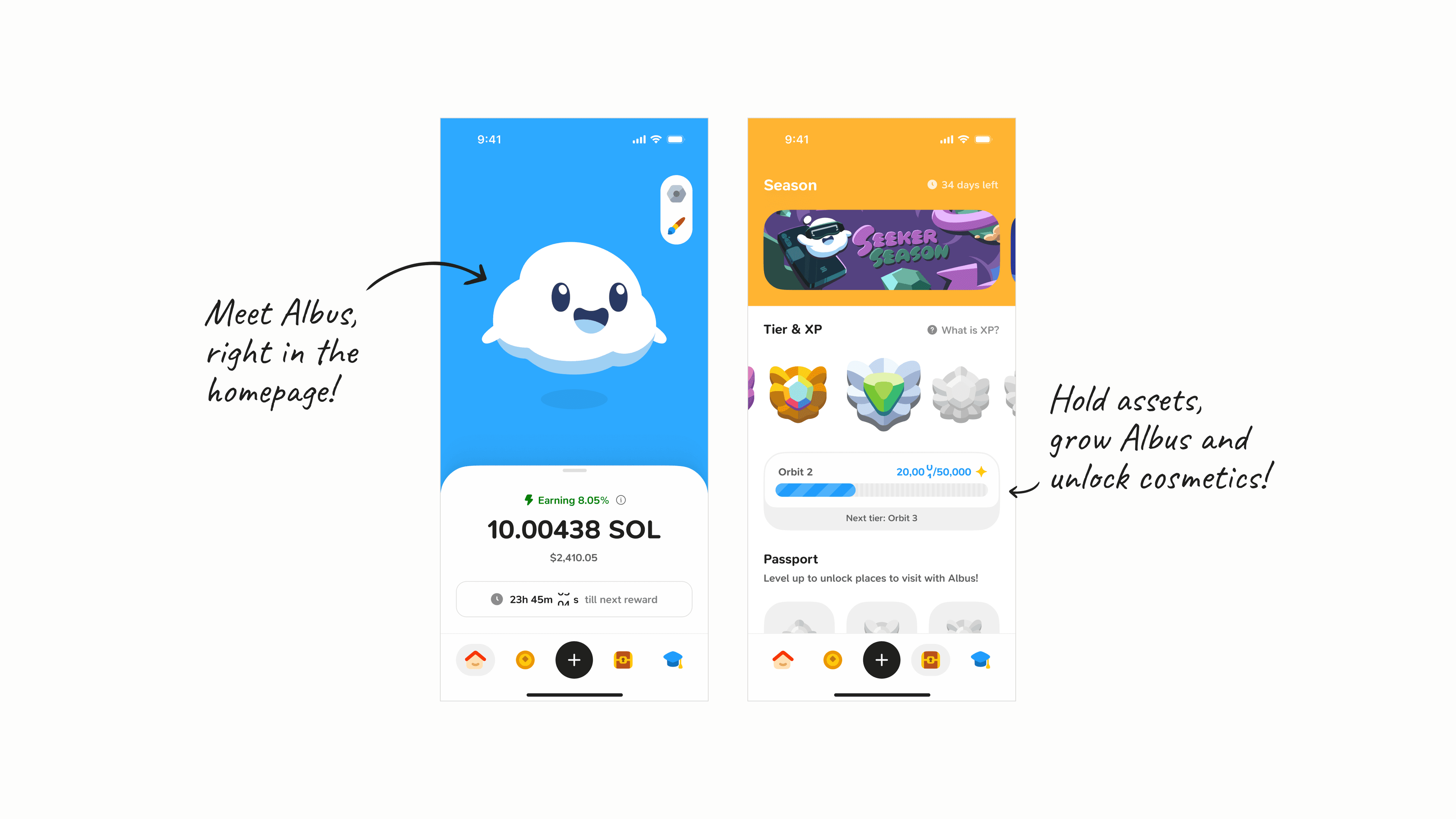
We introduced Albus, a cute little puff of cloud, along with an XP system that rewards users for good investing habits.
Fun appearance and interactions#
One defining design choice was placing Albus on the homepage and using a collapsible tray to house your account balance and other information. The collapsible tray was intentional, as it made room for future actions with cosmetics and interactions with Albus. More cosmetics, more interactions, more delight!
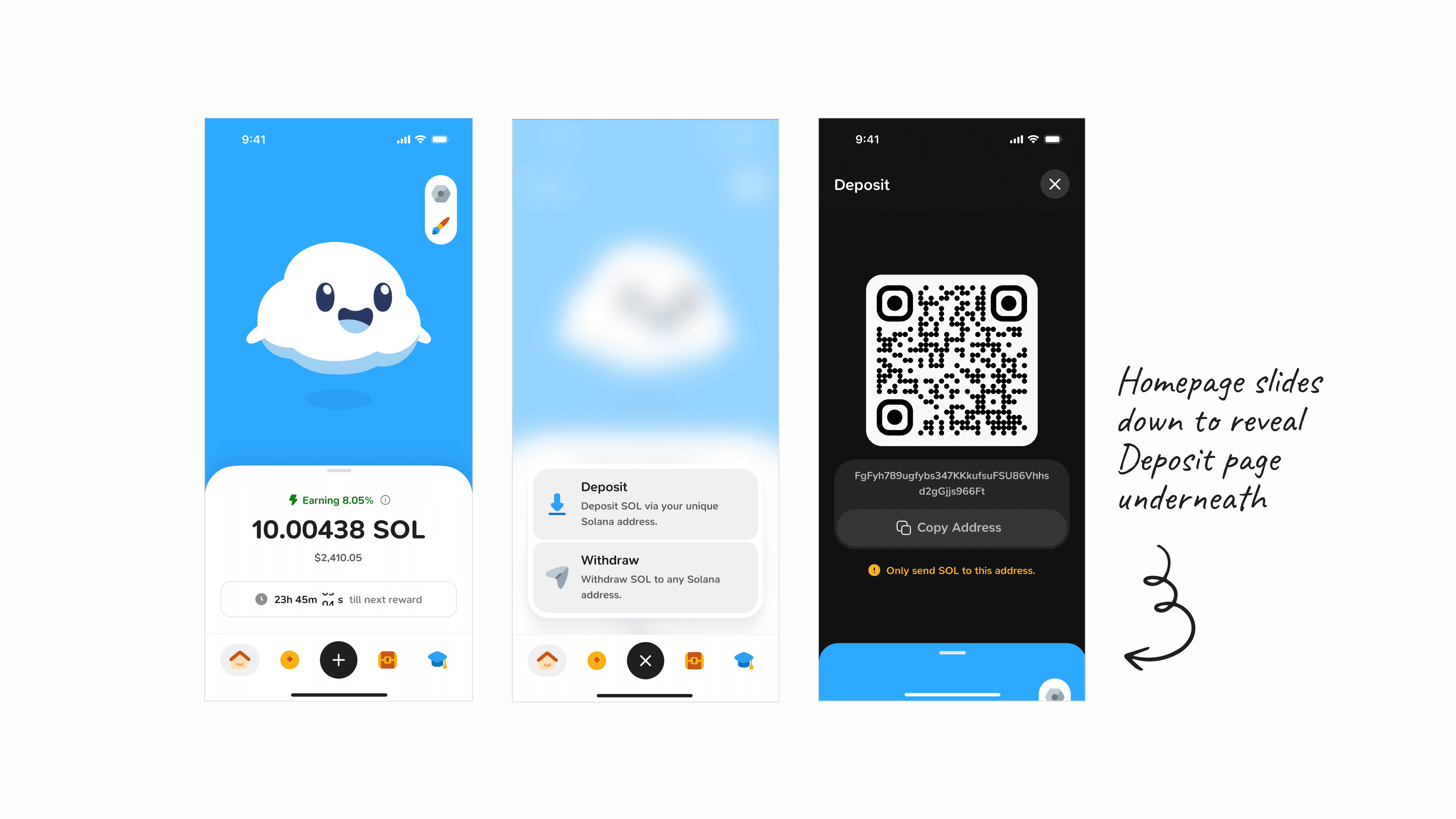
A collapsible tray with big rounded corners also feels more playful in and of itself. This collapse-to-reveal pattern is also to transition from the homepage to the deposit screen.
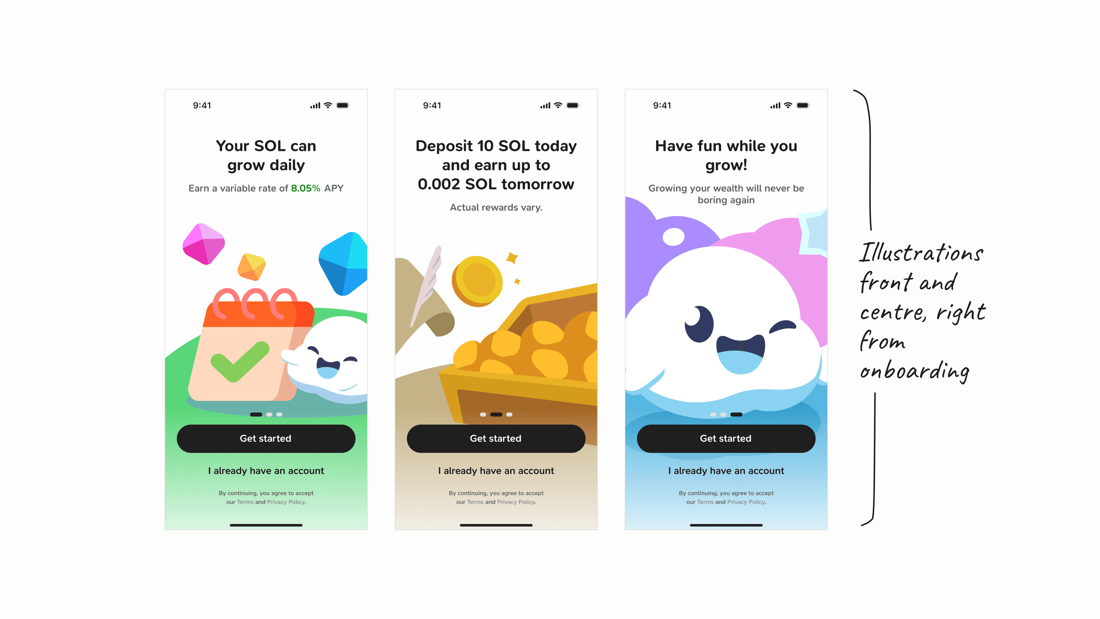
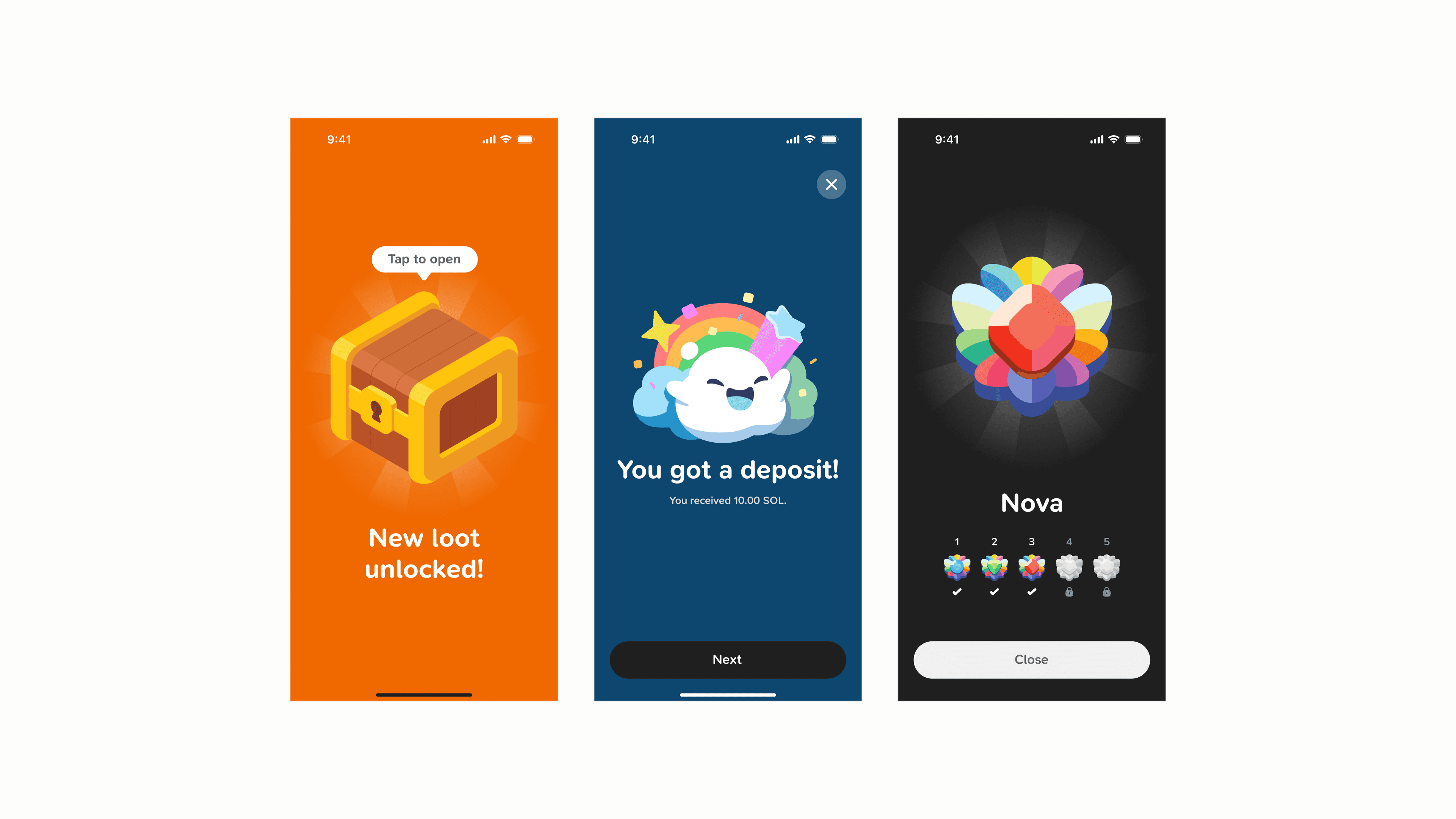
In-app illustrations also became a key part of the overall Sanctum App experience. From obvious screens like the onboarding and homepage, to easily overlooked ones like infomation banners and Library articles, we iterated to make sure that they all looked like Sanctum. We worked closely with Ellinx on the illustrations, the magician that brought our vision to life.
Similar to how we approached illustrations, we added more life into our icons by adapting the standard icons from Huge Icons that we were using initially. These custom icons are sprinkled across the app, and they definitely help tie the whole experience together.
We even showed some love to our internal tools. Our team particularly liked our dev build's icon, which was designed to look like an old school cutting mat (a once important tool for designers, iykyk).
This was 0 → 1#
As of the time of writing, the Sanctum App has been out in beta for only a few weeks. Only time will tell if our design choices are actually effective in helping users build good, long-term habits. But as of now, we had fun bringing this from concept to a real product, and we hope that users will also have fun using it.
Special shoutout to Aaron Gillett who designed the app with me, to Ellinx for the wonderful illustrations, and the rest of the team for bring this app to life.
--
Note: Opinions in this essay are my own. Nothing in this essay or illustrations are financial advice.